Hey Trader! If you’re taking your first steps into the fascinating (and sometimes a bit chaotic) world of trading, or if you simply want to refresh your knowledge, there’s a fundamental starting point you can’t ignore: charts. They are our map, our compass, our magnifying glass for understanding what’s happening in the markets. Without them, we’d be like sailors without a North Star.
But not all charts are created equal. Each has its own personality, strengths, and nuances. Today, we’ll embark on a journey together through the three most common and powerful chart types every trader should know: the Line Chart, the Bar Chart (OHLC), and the undisputed king, the Candlestick Chart. Get ready to discover their secrets, their advantages, their disadvantages, and, most importantly, how to read them to make them speak.
1. The Line Chart: The Simplified Map
Imagine looking at a race car’s path from above. You’d only see the line the car traced on the circuit, without worrying about the speed at each specific point, or how much it drifted around corners. Well, the line chart is exactly that for prices.
What It Is and How to Read It
The line chart is the simplest of them all. It simply connects the closing prices of a given period (be it a day, an hour, a minute). Each point on the line represents the final price of a time interval.
How to read it: It’s like a “camera” that takes a snapshot of the price at the end of each interval. The resulting line shows you the general trend: Is it going up? Is it going down? Is it flat?
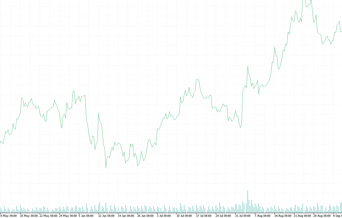 ◎ Esempio di Grafico Lineare per un Asset Finanziario (Un grafico lineare che mostra l’andamento del prezzo di chiusura di un asset nel tempo, con una linea che collega i vari punti.)
Advantages
- Cleanliness and Clarity: It’s incredibly easy to read and understand at a glance. Perfect for beginners or those who want a quick overview of the underlying trend.
- Trend Identification: Given its simplicity, it’s excellent for identifying main trends and significant support and resistance levels.
Disadvantages
- Limited Information: Its biggest disadvantage is that it only provides the closing price. It tells you nothing about where the price opened, the highest point reached, or the lowest point touched during that period. For a trader, it’s like having only part of the story.
- Lack of Depth: Lacking the internal details of each period, it’s not ideal for in-depth analysis or for identifying more complex price patterns.
2. The Bar Chart (OHLC): The Detailed but Essential Story
If the line chart is the race car’s path, the bar chart is like having a recorder that tells you the start of the race, the fastest point, the slowest point, and where the car crossed the finish line. It’s a significant leap in quality!
What It Is and How to Read It
OHLC stands for Open, High, Low, Close. Each individual vertical “bar” represents a time interval (an hour, a day, a week) and provides you with four crucial pieces of information:
- Open: The horizontal dash on the left side of the bar.
- High: The upper tip of the vertical bar.
- Low: The lower tip of the vertical bar.
- Close: The horizontal dash on the right side of the bar.
How to read it: The length of the bar indicates the price range for the period (volatility). The position of the open and close dashes shows you the direction: if the close is above the open, the price rose during that period (bullish bar); if the close is below the open, it fell (bearish bar). Often, bearish bars are colored red, and bullish ones are green or blue.
Advantages
- Richness of Information: It offers a much more complete picture than the line chart, providing essential data to understand price dynamics within a given interval.
- Volatility and Range: It allows you to immediately visualize the price movement range within a period, indicating times of high or low volatility.
Disadvantages
- Less Visually Intuitive: Although rich in data, for some traders, it can appear a bit “jagged” and less immediate to interpret visually compared to candlesticks.
- Lack of Aesthetic Impact: The information is present but doesn’t always “pop out” as it does in other chart types.
3. The Candlestick Chart (Japanese Candlesticks): The Market’s Narrative
We’ve arrived at the main event, the chart type that has become the de facto standard in modern trading. If bar charts are data recorders, Japanese candlesticks are true visual storytellers. Each candle is a small work of art that encapsulates the emotion and action of buyers and sellers.
What It Is and How to Read It
Japanese candlesticks originated centuries ago to track the price of rice and are still the preferred tool for most traders today. Each candle, like OHLC bars, represents a time interval and shows the Open, High, Low, Close prices, but does so in an incredibly more intuitive and visual way.
A candle is composed of:
- Body (Real Body): The central “fat” part of the candle. It indicates the range between the opening and closing prices.
- If the closing price is higher than the opening price, the body is usually green or white (bullish candle).
- If the closing price is lower than the opening price, the body is usually red or black (bearish candle).
- Wicks or Shadows: The “thin lines” that extend above and below the body.
- The upper shadow indicates the High reached.
- The lower shadow indicates the Low reached.
How to read it: The size and color of the body tell an immediate story of the strength of buyers (long green/white body) or sellers (long red/black body). The shadows show volatility and the price’s attempts to move beyond the open/close range. Short candles with long shadows (like a “doji” or “hammer”) can indicate indecision or potential trend reversals.
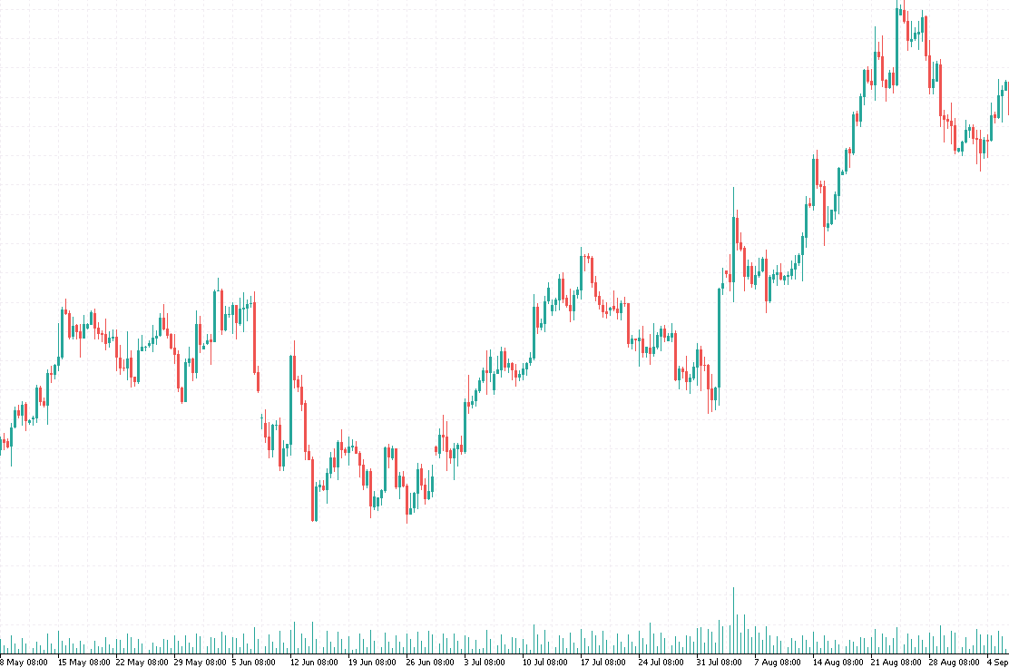 ◎ Analisi di un Grafico Candlestick con varie Candele (Un grafico candlestick che mostra diverse candele, alcune rialziste (verdi) e alcune ribassiste (rosse), con corpi e ombre di diverse lunghezze.)
Advantages
- Unparalleled Visual Power: Their ability to represent the interaction between buyers and sellers so vividly makes them extremely powerful.
- Recognizable Patterns: There are hundreds of candle patterns (such as Engulfing, Doji, Hammer, etc.) that can signal trend continuations or reversals with surprising accuracy.
- Analytical Depth: They allow traders to read the market’s emotion behind each price movement, which is fundamental for technical analysis.
Disadvantages
- Initial Complexity: For a novice, the number of patterns and the nuances of each candle can be a bit daunting at first. It requires study and practice.
- Risk of Over-Analysis: The wealth of information can lead to over-analyzing each individual candle, losing sight of the bigger picture.
Quick Comparison: Which Chart to Choose?
There’s no single “best” chart, but each is better suited for specific needs and analysis styles.
| Feature | Line Chart | Bar Chart (OHLC) | Candlestick Chart |
|---|---|---|---|
| Price Detail | Close Only | Open, High, Low, Close | Open, High, Low, Close |
| Ease of Reading | Very Easy | Easy but less intuitive | Requires practice, but very visual |
| General Trend | Excellent | Good | Good |
| Volatility and Range | Not visible | Visible via bar height | Very visible via body and shadows |
| Sentiment Analysis | Not possible | Limited | Excellent thanks to colors and shapes |
| Price Patterns | No | Difficult to identify | Many recognizable patterns (reversals/continuations) |
| Ideal For | Quick overview, beginners | Traders seeking more info than line | Experienced traders, in-depth analysis, sentiment |
Friendly advice? Start with the line chart to grasp general trends. Then, immediately move on to the candlestick chart. It’s the most powerful tool at your disposal, and once you learn to read it, you won’t go back. Bar charts are a middle ground, but candlesticks simply have that “something extra” in terms of intuitiveness and visual detail.
Conclusion: Make Your Chart Your Best Friend
Understanding the different chart types is the first step to becoming a conscious trader. Each chart offers you a unique perspective on price behavior and the forces at play in the market. It’s not about choosing one chart and always using it, but about understanding what each offers and how to combine them for a more complete view.
Remember: charts are not just lines and colors; they are the visual representation of the psychology of thousands, if not millions, of market participants. By learning to read their stories, you can make more informed decisions and increase your probabilities of success.
Now that you have the basics, the next step is practice! Open your trading platform, start exploring the charts, and see the differences with your own eyes. Happy trading!